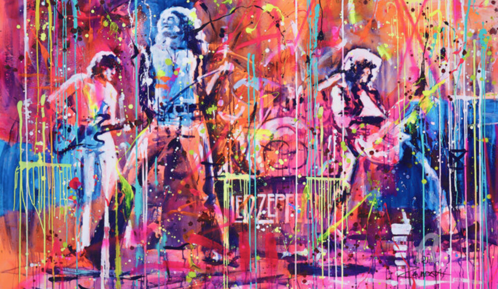
 Marta Zawadzka, On the stage, 2022. Acrylic / ink / oil / spray on canvas, 140 x 195 cm.
Ties: Andy Warhol & the world of music.
"Andy Warhol looks like a scream.
Hang it on my wall."
Through the famous refrain of David Bowie's song entitled Andy Warhol, we present the undisputed master of Pop art in a less popular version, such as that of a music manager and producer, as well as the creator of some of the most iconic album covers of all time. Warhol approached music graphic design in the late 1950s, a period when the record industry was flourishing, during which the artist was hired on a freelance basis by both Columbia and RCA Records in order to design album covers and promotional content. This role would be maintained by the master even later on, when he, through his Factory, i.e., his famous studio and gathering place for artists, devoted himself to launching musical groups and creating multiple record covers, through which he succeeded in an almost impossible feat: to give music an image. This particular intent resulted in the creation of fifty-three music album covers, which, ranging from rock, jazz, classical music, and the pop genre, include the famous images designed for the Rolling Stones, John Lennon, Diana Ross, Paul Anka, The Velvet Underground, John Cale, Aretha Franklin, and many others. Although many of these works turn out to be widely known, the extensive research in the graphic-music field carried out by the Pop master has only been extensively appreciated since the publication of the book Andy Warhol: The Record Covers, 1949-1987, which, authored in 2009 by Paul Maréchal, has chronologically reconstructed this type of the artist's work in the music industry. Through this volume, it is possible to become "familiar" with the albums made by Warhol, which, in most cases, can be divided into two main strands: those that depict objects that have nothing to do with the album's narrative, such as the banana from The Velvet Underground & Nico, and those that portray musicians in the foreground, such as the John Lennon from Menlove Avenue.
 Vincent Sabatier (VerSus), Roboclusion pink floyd, 2022. Sculpture, Resin / Marker / Casting / Engraving on Other Substrate, 25 x 20 x 5 cm / 0.80 kg.
 Paul Stowe, Kurt Cobain, 2022. Drawing, Graphite on paper, 37 x 54 cm.
So damn rock 'n roll: Andy Warhol, the Velvet Underground and the Rolling Stones!
Even if you have never listened to The Velvet Underground & Nico, one of the greatest rock, underground, experimental and alternative albums of all time, chances are that you are familiar with its cover, which, on a white background, hosts the image of a banana, cleverly accompanied by cursive writing, intended to make clear allusion to the name of its creator: the undisputed master of Pop art Andy Warhol. Such a "fusion" between music and graphics was the result of a meeting in 1966, during which Andy, after seeing a performance by the aforementioned band, proposed to Lou Reed, John Cale, Sterling Morrison and Maureen Tucker that he become their manager and art director, as he recognized in their work a great affinity with his figurative point of view. Once he acquired this position, Warhol added the singer Nico to the group and created the provocative image of the aforementioned debut album, which, in its early versions, allowed the purchaser to peel the fruit in order to make visible another banana, which, allusively flesh-colored, hinted at much more. Despite the hype aroused by this image, The Velvet Underground & Nico did not achieve a fair amount of success at the time, so much so that the album's flop led to tensions among the band members and, progressively, even to the end of their collaboration with the Pop artist. This turbulent history did not distract Warhol from his interest and connection with the musical world, so much so, that, almost ten years later, he produced another provocative, and highly iconic, album graphic: that of Sticky fingers by the Rolling Stones. In fact, it was on April 21, 1969, that Mick Jagger approached the Pop master to ask him, by letter, to design the cover of his new record, granting him full freedom of expression, although he suggested that the artist avoid complicated designs so as not to cause delays in production. Andy Warhol completely ignored the frontman's advice, devising the crotch close-up of a pair of jeans, whose real and elaborate lowerable zipper, alas, was capable of damaging the stacked records in the production and transportation process. In reality, however, the worst problems were related to the cover's subject matter itself, which, aimed at capturing a clear bulge of the genital area, aroused a major uproar, so much so that it was censored in more traditional countries such as Spain and Russia. In conclusion, it is good to end the story by revealing the identity of the owner of these iconic jeans, who, although identified by many as Mick Jagger himself, appears to be Jeo Dallesandro, actor and Factory star. Finally, it is good to highlight how not only Andy Warhol, but also many other artists have made iconic album covers as well as band logos, images that are often revived through original contemporary remakes, exemplified by the work of some of Armajeur's artists, such as, for example, Jürgen Haffa, Giuseppe Valia, and Ananou.
 Giovanni Andrea Negrotti, Jim Morrison, 2019. Acrylic on canvas, 80 x 90 cm.
 Secam, Voodo child, 2018. Acrylic / marker on canvas. 80 x 80 cm.
 Jürgen Haffa (creator), The Rolling Stones, 2022. Digital art, photomontage on aluminum, 150 x 112 cm.
Jürgen Haffa: Rolling Stones
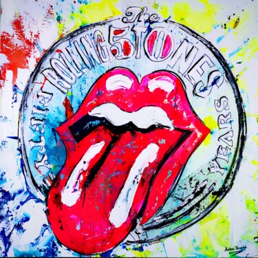
Jürgen Haffa, a professional artist and photographer who has been active in the field of advertising and videography for 30 years, often combines the use of photography technique with that of Photoshop in order to investigate purely "rock and roll" themes, such as, for example, skulls, American flags, eagles and whiskey. The recurrence of this topic, however, is also highly observable in the experimentation with digital art and photomontage by Haffa, whose stylistic features are well exemplified by works such as Rolling Stones, having as its subject the British band's iconic tongue. This famous logo, made extremely contemporary by the Artmajeur artist's point of view, finds its earliest origins in 1970, that is, when a representative of the Rolling Stones contacted the Royal College of Art in London in order to get in touch with a student to be entrusted with the creation of the band's European tour poster. The chosen one was John Pasche, who, at a later stage, was also contacted by the band for the execution of another work, such as the creation of an impactful, but at the same time simple and effective symbol. The result of the latter request was the famous tongue logo, a work that was paid only fifty pounds and made its first public appearance in 1971, namely on the occasion of the release of the album Sticky Finger, where it appears on the back cover.
 Giuseppe Valia, The Beatles (Abbey Road), 2021. Acrylic on canvas, 150 x 150 cm.
Giuseppe Valia: The Beatles (Abbey Road)
Giuseppe Valia's rich figurative investigation focuses, among other things, on the personal interpretation of images of famous people, cult places and extremely well-known masterpieces, which are rendered through the artist's particular pictorial-Pop vocabulary. What has just been stated can be seen in the acrylic The Beatles, in which the original and unprecedented remake of one of the most popular covers of the music world, namely Abbey Road by the British group The Beatles, takes shape, having as its subject the photo taken by Iain MacMillan. That shot dates back to August 8, 1969, the day when, almost in front of the band's famous recording studio located in Abbey Road, the photographer portrayed John Lennon, Paul McCartney, George Harrison and Ringo Starr about to synchronously cross the crosswalk. It was precisely this famous image that had the task of raising awareness of the place where the band had spent most of their revolutionary recording career, turning it into a timeless tourist attraction, where fans go to this day even if only to emulate the features on the cover, which, devoid of the band's name and the title of the LP, shook the music world of the time, alluding to the fact that the greatest band of the time did not need much explanation.
 Ananou, Bruce Springsteen, 2021. Ballpoint pen on paper, 30 x 30 cm.
Ananou: Bruce Springsteen
Ananou's ballpoint pen tinges the Pop world blue, a "dimension" rendered through the artist's paper medium, always ready to capture consumer objects, show business personalities and iconic music albums, such as, for example, the famous Born in the USA, featured in the drawing titled Bruce Springsteen. In fact, it is precisely Born in the USA that is the seventh album released by American rocker Bruce Springsteen, which, released by Columbia Records on June four, 1984, features on its cover a popular Annie Leibovitz shot, depicting the singer-songwriter with his back turned in front of a stars and stripes background. Such a context alludes to Springsteen's intentions to present himself as an ordinary American through the highly shareable views of his music. As for Bruce showing his butt on the cover, on the other hand, rather than his face, the rocker himself ironically revealed that, of all the shots, he had chosen the one in which his most photogenic part appeared.


 Olimpia Gaia Martinelli


