Official poster for the Stockholm Olympics, 1912. @lovett_art_history
What is a poster?
The poster is a sheet of paper printed with a purely advertising purpose, in fact, it represents a type of visual communication designed specifically for public places, with the aim of transmitting a message through words, images or / and symbols. The history of this means of communication, despite its ancient origins, having been used in its most archaic forms since the time of the Greeks and Romans, is inextricably linked to the invention of printing techniques in the mid-fifteenth century. The poster as we know it today, however, was born in the mid-nineteenth century, the result of progress in printing techniques, which have transformed it into, both a fundamental means of advertising propaganda, and a high form of artistic expression.
The official poster for the Beijing Olympics, 2022. @beijing2022
The new poster
The most common type of poster in the 19th century was lithography, which was replaced in the early 20th century by the more modern offset lithography. Nowadays, computer technology has imposed itself in this sector, allowing the creation of new, infinite and previously unthinkable creative possibilities. Moreover, contemporary posters are characterized by an innovative predominance of images, logos, signs and symbols, which occupy the communication space to the detriment of words. In fact, in the communication of our times, the choice and the use of colors becomes decisive, which must necessarily be bold and contrasting, in order to attract the eye of the observer. All these new shrewdnesses arise from the idea of wanting to generate an instantaneous communication, whose objective lies in the immediate understanding of the message contained in the poster.
Walter Herz, Official poster for the London Olympics, 1948. @libreriaurbe
What is an Olympic Poster?
The Olympic poster was created with the purpose of communicating information, having the aim of promoting a specific edition of the Games, always including some iconic symbol of the event, such as: the Olympic flashlight, the Olympic rings, the mascot and the specific sports. This communication tool was used for the first time at the 1912 Stockholm Olympic Games, when the host cities were charged with organizing the promotion and advertising of the event. It is good to highlight how the official poster, to become such, must be selected by the Organizing Committee of the Olympics, which establishes a competition, where the designers, deprived of complete artistic freedom, must submit to a specific image of the Games. In fact, the artists must draw on a specific vocabulary, which must include both the figurative elements significant to the host country, such as public monuments and flags, and the pre-established graphic elements distinctive to the event, such as, for example, the Olympic rings. The most recent posters, as mentioned above, prefer to use as little text as possible, limiting themselves to the name of the host city and the year of the Games. On the whole, this precious form of communication represents a true tradition, which has become a reminder of the evolution of the Games, design and poster design.
Fritz Hellinger and Keerl, Official poster for the St. Moritz Winter Olympics, 1948. @internationalpostergallery
Analysis of the graphics of: "Olympic Winter Games 1948 St. Moritz Switzerland".
After the Second World War, Switzerland hosted, precisely in St. Moritz, the edition of the 1948 Winter Olympics. Just for this occasion, the Swiss poster designer Fritz Hellinger and the photographer Keerl, created the poster of the event, a work that perfectly sums up the peculiarities of the host place, such as: the bright sun, white mountains, snow and fashionable tourists, the latter personified by the couple of characters depicted. In fact, St. Moritz is known both for its bright sunshine and for its suggestive mountains, which make it one of the most renowned elite ski resorts in the world. Speaking of symbols, the lithograph features, just above the text, the iconic rings, which were used for the first time on this occasion. Together with the rings, there is also the Swiss shield, which, placed at the top right, has the purpose of explaining how the continents of the world, indicated by the rings, must, on this occasion, have Switzerland as a geographical reference point. The text that appears on the poster, "Olympic Winter Games 1948 St. Moritz Switzerland", makes explicit the title, the year and the place of the event. Finally, all of these peculiarities make the poster the bearer of a double message: to inform the public of the upcoming Winter Olympic Games and to encourage post-war tourism.
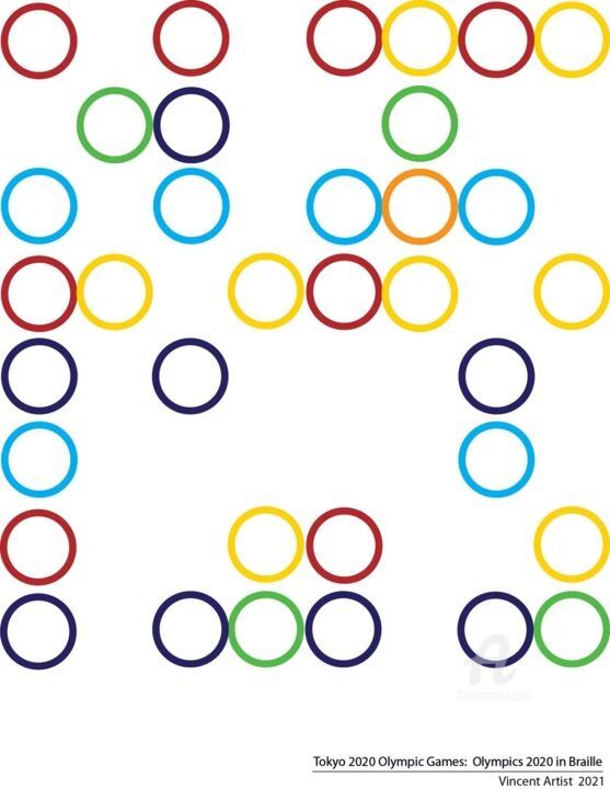 Vincent Artist, Tokyo 2020 Olympic Games, 2021. Digital painting / photomontage on paper, 30 x 21 cm.
The (unofficial) Olympic posters created by the artists of Artmajeur
Vincent Artist: Tokyo 2020 Olympic Games
The artists of Artmajeur, always attentive to the traditions, trends and innovations of the world of graphic arts, have had fun creating very personal interpretations of the posters of the Games, following different purposes: to give life to new re-elaborations of pre-existing posters, to create innovative suggestions for future ones and, on some occasions, to design real ironic and mocking versions of the aforementioned. Vincent Artist's digital painting, Tokyo 2020 Olympic Games, offers a new and contemporary interpretation of the official poster of the Japanese event, where, in accordance with the objectives of modern communication, the presence of text and figurative images is reduced as much as possible, in order to favor the predominance of the key symbol of the Games, the Olympic rings, which are innovatively reproduced by referring to Braille characters.
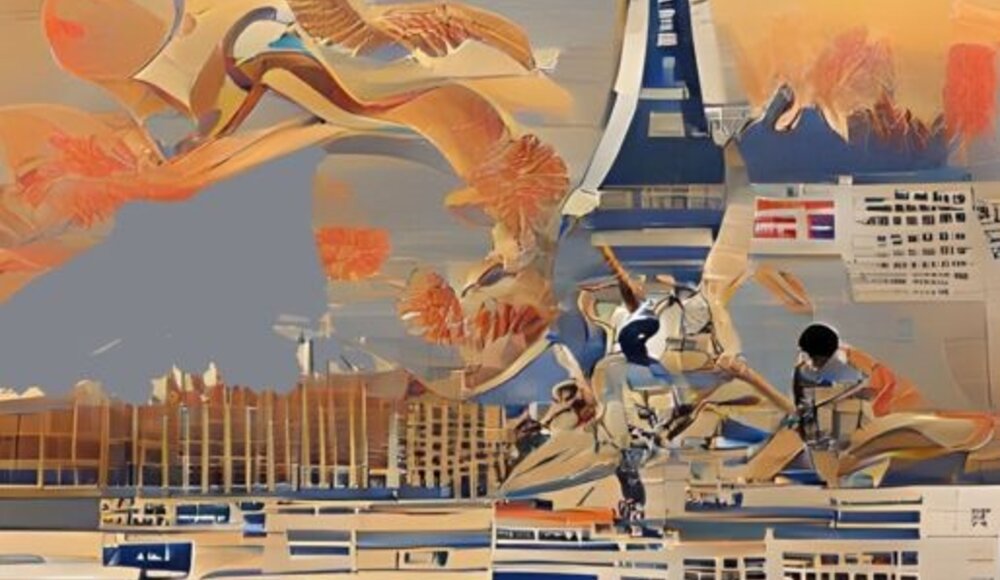
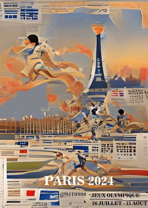 Dominique Kleiner, Olympic Games Paris 2024, 2021. Digital painting / photomontage on aluminum, 80 x 60 cm.
Dominique Kleiner: Olympic Games Paris 2024
The interpretation of the Olympic poster by the artist of Artmajeur, Dominque Kleiner, has the purpose of proposing itself as a hypothetical illustration of the future Games in Paris, which, distinguished by the richness of images aimed at explicit the location and the sports protagonists of the event, turns out to be more akin to the old school posters, where, unlike the contemporary symbolic minimalism, figures, architectures and landscapes were preferred.
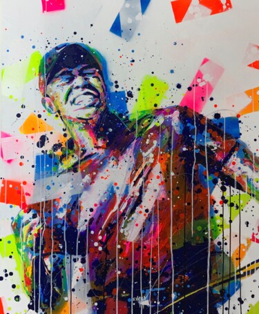
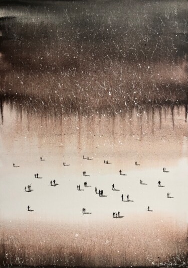
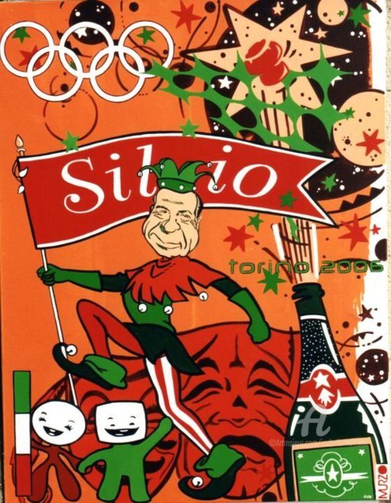 Murzo, Made in Italy - Silvio, 2006. Acrylic / spray paint / stencil / marker on canvas, 130 x 100 cm.
Murzo: Made in Italy - Silvio
The painting by Artmajeur's artist, Murzo, has re-proposed in a mocking key the poster of the Turin 2006 Olympic Games, transforming it into a real carnival party, in which the protagonist of the work, Silvio Berlusconi, cannot absolutely miss. Therefore, Made in Italy - Silvio was able to use innovatively the language and the symbols of the graphics of the Games, in order to create a unique, funny and irreverent satirical work of art, indissolubly linked to the discussed and talked about image of the former Italian Premier.
 Olimpia Gaia Martinelli