 Paul Klee, Ad Parnassum, 1932. Oil on canvas, 100×128 cm. Kunstmuseum, Berna.
Basic Notions of Abstract Art
Just to provide the reader with a "when" and "where": abstract art, an avant-garde art movement, was born in the early 20th century in Germany, spreading to various regions of the country that were quite distant from each other, where it took on different visual and conceptual variations. In essence, abstract art refers to all artistic production whose core revolves around the creation of works that explore realities freed from previous artistic traditions, where colors and forms become the new focus of a narrative, ready to express the artist's emotions, ideas, and experiences. It is important to specify that there are two ways to be abstract: partial and complete. In the first case, we are referring to works that still present identifiable subjects, but these have been simplified, distorted, rendered in unrealistic ways, or removed from their usual context. Regarding complete abstraction, on the other hand, it refers to creations that transcend the representation of contexts, aiming to draw inspiration from actual visual reality. In both cases, the aim is to challenge the purpose and meaning of art, potentially freeing it from its relationship with the surrounding world, expanding the boundaries of what could be understood as artistic production. This consequently challenges the more traditional aesthetic canons in order to take art by the hand and lead it towards more open and experimental modes. These are particularly effective whenever one wishes to express philosophical principles and ideologies, ideas that are sometimes too complex and elusive to be confined within figurative subjects. The viewer is also included in this "game," and their role takes on new importance: that of interpreting what they see, both in their own way and by comparing it with the artist's perspective. Now that we have briefly clarified the historical and artistic context in which we are operating, we can start with our top 10, which, in chronological order of the date of the paintings shown, can be considered a continuation of the aforementioned narrative, capable of presenting the various evolutions of the movement in question.
 Vasilij Vasil'evič Kandinskij, Untitled (First Abstract Watercolor),1910. 49,6 x 64,8 cm. Centro Georges Pompidou, Paris.
Top 10
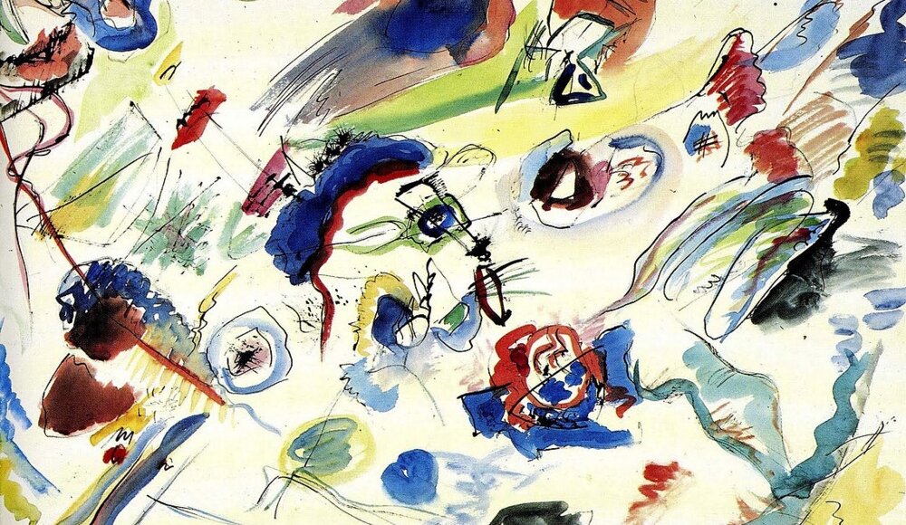
1.Wassily Kandinsky, Untitled (First Abstract Watercolor) (1910)
Why start with Kandinsky? I chose to place Untitled at number one on my list because critics consider it the beginning of Abstract Art. In this watercolor, the Russian painter eliminated any reference to the visible world, creating a synthesis between music and painting to generate entirely new images that allude to emotions and moods. This is achieved through carefully chosen colors, lines, points, and spots, organized in an extremely harmonious manner. It's worth noting that before Kandinsky, Cubism and Impressionism had pushed the boundaries of visual comprehension, as seen in the works of Braque, Picasso, or Monet's later water lilies. However, within their works, some reference to the real visual world still persisted, whereas in Untitled, Kandinsky deliberately decided to eliminate all references to tangible reality, painting only lines, spots, and marks meant to represent themselves. The watercolor is dominated by brown, yellow, and orange spots, some denser than others, forming a cluster resembling constellations. The rhythm of these elements, combined with the harmonious use of colors and the relationship between the marks, gives a sense of composition.
Joan Miró, The Hunter (Catalan Landscape), July 1923-winter 1924. Oil on canvas, 64.8 x 100.3 cm. Moma, New York. @ssteph888
2.Joan Miró, The Hunter (Catalan Landscape) (1923-24)
The second position in my ranking, in chronological order of execution, goes to Joan Miró with his painting The Hunter (Catalan Landscape). This artwork exemplifies the aforementioned concept of partial abstract art. I can confidently state this because upon careful observation, the masterpiece reveals the depiction of a distinctive landscape with human and animal figures, alluding to a specific period in the artist's life when he lived on his family's farm in Montroig (Catalonia). Why take the viewer to this place in Spain? The painting might indeed speak of the master's homeland, aiming to highlight a certain inclination toward Catalan nationalism, evident in the allusion to the region's traditional dance, explicitly expressed by the word "sard," along with the presence of the Catalan flag, as well as the Spanish and French flags. Setting aside such interpretations, what is certain about the work is that it represents the artist himself, portrayed, as in other instances, in the guise of a hunter. I refer to the stylized figure with a triangular head, situated on the left side of the canvas, holding a freshly killed rabbit and a still-smoking rifle. However, everything described can also be interpreted within the realm of the dreamlike, as the surrealist masterpiece is a product of automatism, the use of the subconscious, conducive to rendering new forms and interpretations of reality.
 Piet Mondrian, Composition with Red, Yellow, and Blue, 1930. Oil on canvas, 45 cm × 45 cm. Kunsthaus Zürich
3.Piet Mondrian, Composition with Red, Yellow, and Blue (1930)
Let's return to complete abstraction with Piet Mondrian and his famous Composition with Red, Yellow, and Blue, a work created in the interwar period, during the peak of the artist's career. Given the circumstances, he felt more serene and capable of dedicating himself to his artistic research, aimed at the goal of neoplastic synthesis. I refer to the process of formal simplification, aimed at achieving a specific desire for spiritual purification felt by the painter, who, also influenced by theosophical studies, progressively abandoned figuration. This is realized in the aforementioned work, characterized by the presence of thick black lines that intersect to create rectangular and square fields, some of which are colored in red, yellow, and blue. The choice of primary colors is intended to reproduce formal and chromatic balance, reflecting the artist's spiritual quest, guided by universal equilibrium. In this case, equilibrium is found in the absence of a compositional geometric center, implying that the masterpiece could potentially extend beyond the painted canvas.
 Paul Klee, Ad Parnassum, 1932. Oil on canvas, 100×128 cm. Kunstmuseum, Berna.
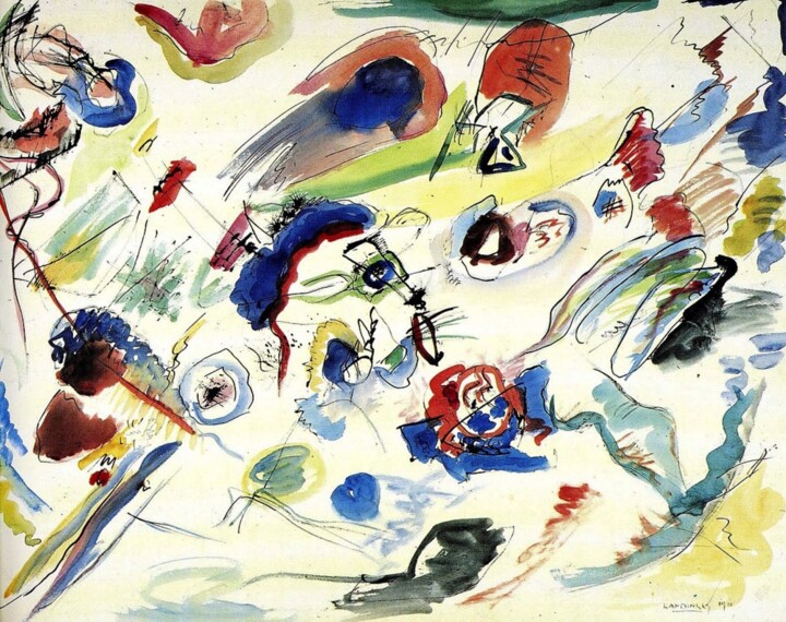
4.Paul Klee, Ad Parnassum (1932)
We are faced with another example of partial abstraction, namely Ad Parnassum, a masterpiece on canvas that Klee created inspired by his stay in Italy six years earlier. During that time, he was struck by the mosaics of Ravenna, which he reinterpreted using a new neo-divisionist technique. This technique is characterized by distinctive pointillist brushstrokes, creating a dense chromatic texture where colors emit a unique, bright light reminiscent of early Christian art. As for the color palette, shades of blue-green and yellow-orange dominate, lending dynamism to the entire composition. The uniform brilliance is broken by the presence of lines that form the silhouette of a pyramidal hill, accompanied by a high sun in the sky. Finally, we conclude this description with the artist's own illuminating words: "The subject was the world, even if not this visible world." Despite these words, what we observe does not entirely lose touch with the reality we know; instead, it recalls it in the form of memory and fragments, conveyed through a complex harmony of colors that reveal the musical melodies the master, a skilled violinist, was well acquainted with.
On the left: Ben Nicholson OM, 1934 (relief), 1934. Oil paint on mahogany, 718 × 965 × 32 mm. Tate. @jay.parmar
5.Ben Nicholson OM, 1934 (relief), 1934
To understand Nicholson's masterpiece, we must consider the historical context in which the artist developed his perspective on art. During the turbulent interwar period, when artists turned to abstraction in search of a lost innocence and purity in humanity, Nicholson began experimenting with different ways of depicting space. He pursued these goals through the creation of relief works, where areas of varying depths defined space, sometimes colored only in white or gray, in the hues of purity. A quintessential example of this monochromatic and multilayered painting is 1934 (relief), a masterpiece that draws inspiration from the influence of Mondrian, much like Miró and Calder. To create this work, Nicholson carved a circle and a square from a wooden panel, alluding to the idea of absence and weighty presence in times of conflict. The use of geometric forms, dimensional layering, and a monochromatic palette all contribute to the removal of emotions.
On the right: Mark Rothko, White Center (Yellow, Pink and Lavender on Rose), 1950. 205.8 cm × 141 cm. The Royal family of Qatar.
6.Mark Rothko, White Center (Yellow, Pink and Lavender on Rose) (1950)
In 1950, Rothko began dividing the canvas into horizontal bands of color, and White Center (Yellow, Pink and Lavender on Rose) was created during this year. The masterpiece presents a frontal composition where large bands of color seem to float and merge with the color field on which they are placed. In essence, White Center is part of Rothko's distinctive multiform style, in which different blocks of complementary colors overlap on a large canvas. Describing it with the addition of color, the work starts with a yellow horizontal rectangle, continues with a horizontal black stripe, a white rectangular band, culminating in the lower half in lavender tones. The luminosity of the entire piece is achieved through repeated layering of thin paint veils, from which some underpainting emerges in the upper layers. What has been analyzed could be applied, certainly with variations, to much of the artist's work during this period. He was intent on seeking subtle variations in proportion and color, suggesting multiple emotions and atmospheres with the aim of enveloping the viewer.
Jackson Pollock, Convergence, 1952. Oil on canvas, 237 cm × 390 cm. Buffalo AKG Art Museum, Buffalo. @Jackson_pollock
7.Jackson Pollock, Convergence (1952)
The canvas is covered with tangled marks, and the presence of black circular lines appears uniform throughout the support, while in other parts, traces of red, yellow, blue, and white are visible. I am referring to the artwork occupying the seventh position, Convergence, initially judged by critics as unimpressive but later became extremely well-known. The initial skepticism of art historians was likely due to the fact that the work, initially in black and white, represented a reconsideration by the artist, who later added additional colors. Convergence's redemption did not only come through later reassessments but also through the recognition of Harold Rosenberg, an art critic who identified it as the highest example of abstract expressionism and action painting. By these terms, I simply mean the artistic practice developed by the painter, where he freely let his most instinctive gestures flow during the creation of his works, translating them into canvases with unmistakable energy.
Helen Frankenthaler, Mountains and Sea, 1952. Oil and charcoal on canvas, 220 cm × 297.8 cm. National Gallery of Art, Washington, D.C. @helenfrankenthalerfoundation
8.Helen Frankenthaler, Mountains and Sea (1952)
Let's talk about technique: Mountains and Sea was created by placing the raw, unprimed canvas on the floor and pouring oil and turpentine-based paint onto it. I am referring to Frankenthaler's personal painting practice, known as staining, which she used for the first time in this particular case. The result is fields of transparent color that appear to float but are actually anchored by the canvas's texture, providing flatness and stability. In this context, the colors are not randomly placed but serve the purpose of evoking a natural environment, each time unique and different. Similar to Convergence, Mountains and Sea, the first work exhibited professionally by Frankenthaler, was initially criticized but later understood, to the point that The New York Times dedicated this delicate and celebratory description to it: "Mountains and Sea" is "a light and diaphanous evocation of hills, rocks, and water."
Robert Motherwell: Elegy to the Spanish Republic No. 57, 1957-1961. Charcoal and oil on canvas, 213.36 cm × 277.18 cm. Collection SFMOMA.
9.Robert Motherwell: Elegy to the Spanish Republic No. 110 (1971)
The masterpiece in question, as partially implied by its title, arises from the memories that the Spanish Civil War left imprinted in the mind of the painter when he was only twenty-one years old. The impact of this disastrous event was such that Motherwell revisited the subject not only in Elegy to the Spanish Republic No. 110 but in a series of more than 200 paintings dedicated to this theme. Similarly, we can recall Picasso's famous Guernica, dated 1937, which once again refers to the episode of the Spanish Civil War. In the case of the author of Elegy to the Spanish Republic No. 110, however, the conflict in question becomes a way to allude to all forms of injustice, to the point that he conceived the aforementioned series as a commemoration of human suffering, a sentiment expressed in the form of abstract and poetic symbols that contrast death and life. This approach of abstract expressionism inherits some elements from the language of French Symbolism, particularly that of Stéphane Mallarmé, a poet who advocated representing the emotional effect produced by events or ideas rather than the events or ideas themselves. Finally, the aforementioned opposition between life and death is concretely rendered on the canvas through the juxtaposition of black and white, as well as the contrast between oval and rectangular shapes.
Gerhard Richter, Abstraktes Bild, signed, dated 1987, numbered 636. @theartbystander
10.Gerhard Richter, Abstraktes Bild (809-1) (1994)
Richter's masterpiece, known for being one of the most expensive paintings among his top ten, is part of a series of four works and is the result of a complicated, repetitive, and likely tedious creative process, of which the canvas itself bears witness, as it displays signs of temporal interruptions in the work. Nevertheless, once completed, Abstraktes Bild took the form of stripes and paint smudges that were dragged to the edge of the canvas using a squeegee and enriched with the addition of other colors applied in a similar manner. In fact, the process of applying the paint, rapid, random, and repetitive, involves layers of color succeeding one another until the artist deems the painting complete. This prompts reflection on how, through the superimposition of different layers, the methods of creating the work are only superficially recognizable because they are, in fact, concealed in the underlying levels. However, we can describe Abstraktes Bild as follows: a surface of vertical and horizontal lines rich in color, intended by the artist to convey calm and harmony to the viewer.
 Olimpia Gaia Martinelli