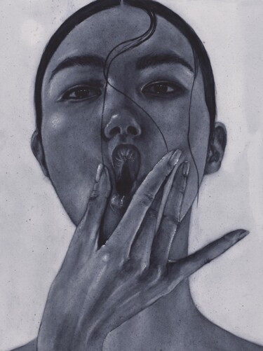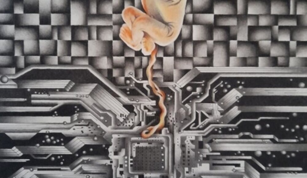
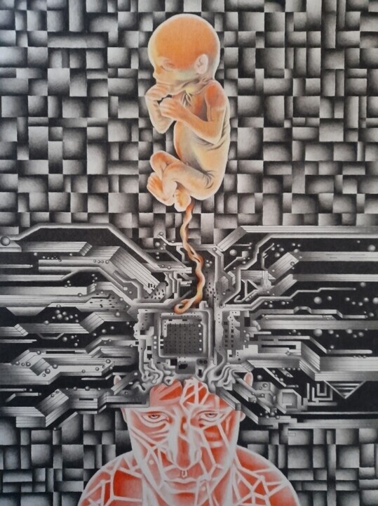
 Futuretico, Digital mental childbirth, 2022. Painting, charcoal / pencil / colored pencils on paper, 60 x 42 cm.
The color grey: meaning, symbolism and therapeutic function
Grey, the typical color of cloudy winter days, of stones unconsciously piled up on beaches, of ancient monuments, of cold clothes worn by workers, of the most varied technological tools, of the iconic Apple apple, and of hair that comes with the passing years, is the result of a particular shade obtained by mixing black and white. Precisely because it is placed midway between the latter two achromatic shades, grey brings to mind the indefinite, as well as moments of suspension, uncertainty and doubt, just as evidenced by the expressions "grey area," used when one wants to talk about an unclear concept, "grey eminence," used to refer to an influential person working behind the scenes; "grey matter," intended to allude almost to the mystery of intelligence; and "grey personality," to describe an individual whose tendency is decidedly uncharismatic and rather restrained. In fact, grey is the color of the introverted, reserved and thoughtful, of those individuals who generally do not impose their own decisions, always proving themselves capable of respecting, precisely because of their peaceful presence, the views of others. However, this accommodating attitude hides an ancient soul, which has become itself because, after being involved in countless life experiences, it has managed to develop an enormous wisdom, which, offered only to those who are truly capable of listening, is expressed in a somewhat conservative, stable, reliable and almost calming manner, devoid of stormy emotional surges. Finally, when it comes to color therapy, an alternative medicine that sees colors as its strong point, grey represents a very valuable shade, which, capable of protecting our minds from too strong emotions, tensions and negative energies, is naturally predisposed to a healthy detachment and a motivating quest for authority. Consequently, the aforementioned hue often turns out to be the favorite of leaders and businessmen and women, who, for obvious reasons, need to exude reliability, sobriety and strict constancy. In addition, color therapy also sees grey as a tool for combating hyperactivity, promoting that stability and sedentariness, which help to spend the multitude of working hours spent in front of the computer with greater serenity. So, after knowing the "powers" of the said color, what are you waiting for to wear the multiple shades of this hue in order to face the "trauma" of Monday morning with calm and motivation?
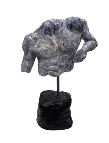
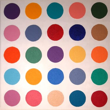
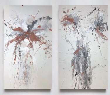
 Anthony Smith, Observation, 2022. Acrylic on canvas, 60 x 50 cm.
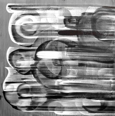
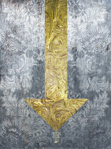
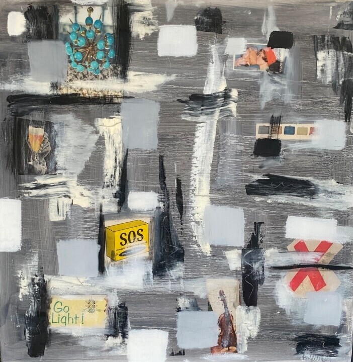 Angelo Dipietrantonio, Sos, 2021. Acrylic on wood, 50.8 x 50.8 cm.
The color grey in the history of art
With regard to the etymology of the word, the term grey derives from the Germanic word grīs, by which it was used to refer to a caned, grizzled person, that is, a figure distinguished by his salt-and-pepper hair. On the subject of the history of the above color, however, it is worth highlighting how this, throughout antiquity and the Middle Ages, was identified as the nuance of the poor, as it was the typical hue of undyed wool worn by the less affluent classes, as well as by monks and friars who wanted to emphasize their condition of humility. Only from the Renaissance onward did grey approach the noble popularity of black, a hue with which it juxtaposed well, both within the world of fashion and art. In the latter context in particular, it appears necessary to make known how, if at first artists created the aforementioned color simply by combining black and white, with the passage of time they also began to obtain it by mixing red, blue, yellow and white, through a process capable of generating multiple and varied gray scales. It was precisely in this rich context that, starting in the 16th century, the technique of grisaille came to the fore, which, used by great masters of the caliber of Rembrandt and Michelangelo, consists of a decoration, or painting, which, done in monochrome, pursues the goal of reproducing light and shadow by means of various shades of grey. In addition, such a nuance, besides being used to prepare the base on which to spread, either gold or skin color, was also used as a background, just as can be seen in some of El Greco's portraits, where the grey context clearly highlights the faces and costumes of the figures immortalized. In addition to the pictorial sphere, during the same historical period, the aforementioned color also established itself in the world of graphic arts, especially in printed books and black-and-white engravings, thanks to which the users of the time had the opportunity to build a rich imagery of grey, aimed at anticipating the advent of color printing. With regard to the period from the 18th to the 19th century, such color became very popular in clothing, as evidenced by work clothes and military uniforms, while, speaking of the art world, it was the undisputed protagonist of some memorable paintings by Jean-Baptiste-Camille Corot and James McNeill Whistler, as well as Pablo Picasso, such as the famous Guernica, a masterpiece in which such color choice was necessarily linked to the message of sadness and devastation carried by the artwork.
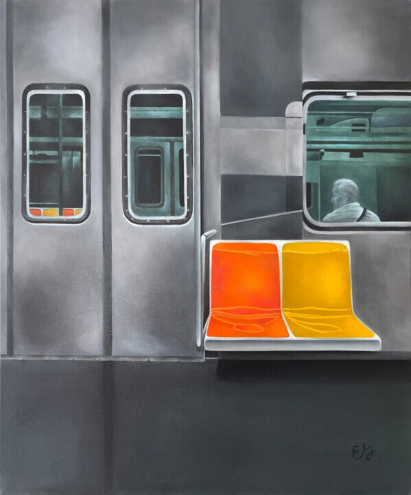 Elise Gobeil, Solo travel, 2022. Oil on canvas, 61 x 50.8 cm.
 Alla Preobrazhenska-Ronikier, Paris. Chairs, 2022. Oil on linen canvas, 110 x 70 cm.
Grey in Artmajeur's artworks
Grey continues to be widely used, and extremely popular, within contemporary art, as a very versatile hue capable of adapting to any type of decor. In fact, this neutral, sophisticated and timeless color is rich in multiple shades, capable of combining with a wide variety of environments and styles, ranging from industrial to modern to contemporary. In addition, the color of ashes matchs well with a wide range of shades, which, starting from white to black, go all the way to pastel shades, cool shades and brighter nuances. Finally, as far as materials are concerned, the ability of the aforementioned color to combine with wood as well as metal and marble is evident. In conclusion, the richness of today's artistic experimentation in grey can be largely exemplified by the work of Artmajeur artists and, in particular, by the works created by Aykaz Arzumanyan, Cynthia Gregorova and 朝乐门.
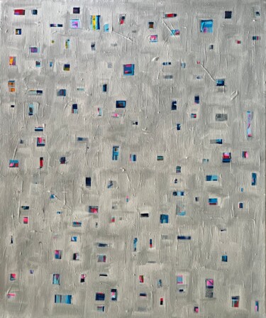
 Aykaz Arzumanyan, N° - 687, 2022. Oil on canvas, 20 x 20 cm.
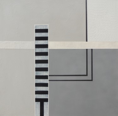
Aykaz Arzumanyan: N° - 687
It is precisely the color grey that triumphs in N° - 687, an abstract composition in which textural rectangles are "accumulated," which, arranged side by side, are evenly distributed over the surface of the canvas, almost evoking a kind of ideal frontal, minimalist, stylized and symbolic reproduction of the order of the rows of seats in the more traditional cinemas and theaters. Within this abstract, monochromatic and repetitive context, however, we also find two exceptions, namely the geometric figures in black and white, which, arranged on the other left side of the support, probably refer to the "parents" of the work's protagonist color. As far as art history is concerned, on the other hand, N° - 687 seems to be a sort of concretization of the encounter between Geometric Abstractionism, a movement that identifies mathematics and geometry as its points of reference, and Material Informalism, a tendency aimed at considering materials and substances as the real protagonists of the works. The result of the above is a painting that, like most of Aykaz Arzumanyan's production, leads the viewer to look beyond the dimension of the everyday, accompanying him or her into a different reality in which geometry, minimalism, monochrome and materiality of artistic investigation triumph.
 Cynthia Gregorova, Dont'speak to me, 2022. Painting, acrylic / pencil / watercolor on paper, 72 x 52 cm.
Cynthia Gregorova: Dont’ speak to me
Cynthia Gregorova's expressionist portrait reveals, through a "confused" and at times "indefinite" figurative composition, the artist's inner world, which, aimed at eschewing the mere representation of the real datum, allows the observer to elicit concrete, violent and, consequently, authentic psychological reactions. In line with what has just been stated are Gregorova's own statements, aimed at describing the aforementioned work in grey, black and white as the mirror of unconscious processes, which determine our desires and fears, as well as the boundaries of human behavior and thought, capable of a shaping character and relationships. However, conflicting feelings, which are always latent in human beings, such as strength opposed to fragility or passivity opposed to aggression, are not excluded from this. On the subject of art history, however, two other portraits in which gray triumphs were made by Francis Bacon, namely Head and Head III, works that strongly detect the temperament of an equally introspective and tormented master, who used painting as a means of expressing his own restlessness.
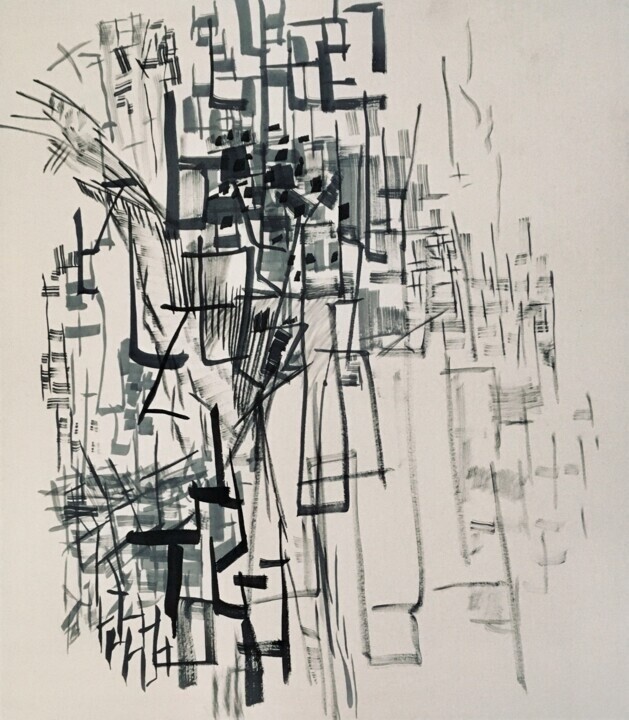 朝乐门, 8-8, 2022. Graphite on cardboard, 80 x 70 cm.
Chao Le Meng: 8-8
On the cardboard support of Chao Le Meng 's graphite work, a multitude of "pseudo-calligraphic" signs are arranged in a seemingly free, instinctive and superimposed manner, whose chromaticism is aimed at investigating those shades, which from the lightest grey come to intensify up to the shades of the most intense and decisive black. Opening a brief art-historical parenthesis, to be placed within the context of the aforementioned artist's affiliation, calligraphy represents one of the main forms of visual art in pre-modern China, in which, through the use of brush and ink, calligraphers have experimented with multiple techniques and styles over the course of several generations. Such graphic expression pursued the purpose of voicing, and consequently externalizing, the artists' inner world, which was expressed through rhythm, movement, and sometimes calligraphic repetition. In this respect, making an imaginative effort, 8-8 might recall the style of Wang Dongling, or one of the greatest contemporary Chinese masters, whose multifaceted work incorporates calligraphy, abstraction and performance.
 Olimpia Gaia Martinelli